

‘Spot Colours’ are used to add to the CMYK print process and can be used to add eye-catching extra inks and special finishes such as foils and varnishes. They can also be used to indicate physical production techniques such as cutter guides and embossing.
The use of the PANTONE colour library is required for inks that are not made from the CMYK process colours. The Pantone colour reference should be explicit in the spot colour name. The easiest way to do this is to use the assigned colour name when adding a spot colour.
Spot colours used in others apps such as Photoshop and Illustrator are OK to use. They should also use the same PANTONE naming.
Other special finishes are not permitted in endpapers so no other spot colours apart from PANTONES can also be used.

The use of the PANTONE colour library is required for inks that are not made from the CMYK process colours. The Pantone colour reference should be explicit in the spot colour name.
Spot colours used in others apps such as Photoshop and Illustrator are OK to use. They should also use the same PANTONE naming.
When including Pantone spot colours to use as inks (rather than indicating special finishes) these colours must be agreed with Production and also marked as acceptable.

Fix this problem by clicking Mark as OK for these spot colours so they will be allowed in subsequent checks of that document.

The use of spot colour extra inks and special finishes adds to the cost of production and so spot colours are typically reserved for the covers files of books that have the budget for them!
There is no need to have unused or unidentified spot colours in output final files and it can cause confusion and delays.
To quickly remove unused swatches from InDesign choose InDesign Window menu > Color > Swatches, from the panel menu choose Select All Unused and click the Trash button at the bottom of the panel to delete:

Similarly you can remove unused layers in your document by choosing InDesign Window menu > Layers and from its panel menu choosing Delete Unused Layers:

Help on working with colour in InDesign
Help on creating and using layers in InDesign

For print production the [Paper] switch is intended to NEVER overprint as wherever it is used should be completely devoid of ink. Instead, when used correctly, it always knocks out all inks to reveal the paper colour beneath.
Overprinting does not make sense for this special swatch therefore and InDesign switches OFF overprint whenever [Paper] swatch is applied.
However, and probably due to a small InDesign bug, in some versions it has been possible to accidentally apply overprint to [Paper] coloured text and objects (from InDesign Window menu > Output > Attributes) by altering the colour to [Paper] after a different colour is first applied. More recent versions will automatically turn off overprinting once [Paper] is chosen
If left unchecked overprinting [Paper] text and objects can cause production delays or disappearing text in the final print.

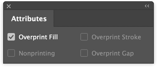
Fix this problem by selecting the object(s) in question, choosing InDesign Window menu > Output > Attributes and deselecting Overprint Fill / Stroke:
Tip: Choose InDesign View menu > Overprint Preview to see how text and objects are set to overprint in the document.

‘Spot Colours’ can be used to add to the CMYK print process. They can add eye-catching extra inks and special finishes such as foils and varnishes. They can also be used to indicate physical production techniques such as cutter guides and embossing.
The use of the PANTONE colour library is required for inks that are not made from the CMYK process colours. The Pantone colour reference should be explicit in the spot colour name. The easiest way to do this is to use the same name when adding a spot colour.
Spot colours used in others apps such as Photoshop and Illustrator are OK to use. They should also use the same PANTONE naming.
The naming of special finishes should indicate the finish that is to be used and selected from this list:

For special finishes that are not listed above an extra ‘SPECIAL’ spot colour can also be used and appended to introduce multiple specials. E.g. SPECIAL-LASERSCORE & SPECIAL-LASERCUT.
If more than one of the same finishes is required then add its name to the end of the spot colour name – e.g. to use two foils the naming for spot colours FOIL-1 & FOIL-2 or FOIL-SILVER & FOIL-GOLD would be acceptable.

‘Spot Colours’ are used to add to the CMYK print process and can be used to add eye catching extra inks and special finishes such as foils and varnishes. They can also be used to indicate physical production techniques such as cutter guides and embossing.
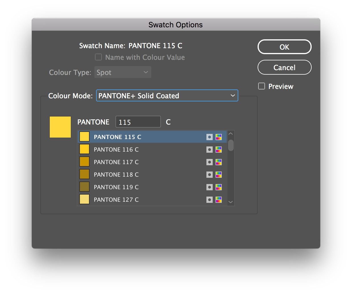
The use of the PANTONE colour library is required for inks that are not made from the CMYK process colours. The Pantone colour reference should be explicit in the spot colour name. The easiest way to do this is to use PANTONE colour mode when adding a spot colour swatch.
Note: Any spot colours – e.g. Pantones – are not split onto separate layers and are included with the main CMYK graphics.

The naming of special finishes should indicate the finish that is to be used and selected from this list:
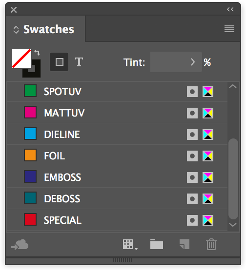
Spot colours are named with these identifiers. Additional special finishes are identified by adding the word SPECIAL to the start of the layer and spot colour name along with a description e.g. SPECIAL-GLITTER.
Each special finish spot colour is added to a separate, named InDesign layer. All content on the special finish layer uses a spot colour swatch set to the same name as the layer and is set to overprint.

Bitmap images (referred to as ‘Black and White’ in InDesign's Links panel) and Grayscale images can be set to overprint by InDesign using its Attributes panel.
To apply overprint to pixel images it is important to select the content of the image frame rather than the image frame itself. Do this using the InDesign Direct Selection Tool, or with a graphic frame selected choose (InDesign Object menu > Select > Content)
With an appropriate image selected in this way, apply overprinting using the Attributes panel (InDesign Window menu > Output > Attributes) and click Overprint Fill:
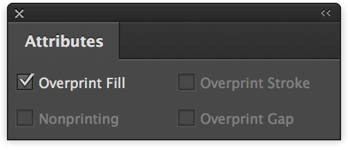
It is also possible to apply overprinting using the Illustrator Attributes panel (InDesign Window menu > Attributes) After selecting the Illustrator artwork with the Direct Selection Tool tick the checkbox to apply Overprint Fill and/or Stroke:

Spot colours used in others apps such as Photoshop and Illustrator are OK to use. Any imported graphics should also use the same naming.
Note: GreenLight is not currently checking vector artwork from Illustrator.

‘Spot Colours’ are used to add to the CMYK print process and can be used to add eye catching extra inks and special finishes such as foils and varnishes. They can also be used to indicate physical production techniques such as cutter guides and embossing.
The use of the PANTONE colour library is required for inks that are not made from the CMYK process colours. The Pantone colour reference should be explicit in the spot colour name. The easiest way to do this is to use PANTONE colour mode when adding a spot colour swatch.
Note: Any spot colours – e.g. Pantones – are not split onto separate layers and are included with the main CMYK graphics.

The naming of special finishes should indicate the finish that is to be used and selected from this list:

Spot colours are named with these identifiers. Additional special finishes are identified by adding the word SPECIAL to the start of the layer and spot colour name along with a description e.g. SPECIAL-GLITTER.
Each special finish spot colour is added to a separate, named InDesign layer. All content on the special finish layer uses a spot colour swatch set to the same name as the layer and is set to overprint.
All special finish text and images are set to overprint. This means that images can be changed during a print run without affecting the underlying base images and artwork.
Pixel images can be saved as either Bitmap or Grayscale in Photoshop:

Bitmap images (referred to as ‘Black and White’ in InDesign's Links panel) and Grayscale images can be set to overprint by InDesign using its Attributes panel.
To apply overprint to pixel images it is important to select the content of the image frame rather than the image frame itself. Do this using the InDesign Direct Selection Tool, or with a graphic frame selected choose (Object > Select > Content)
With an appropriate image selected in this way, apply overprinting using the Attributes panel (Window > Output > Attributes) and click Overprint Fill:

It is also possible to apply overprinting using the Illustrator Attributes panel (Window > Attributes) After selecting the Illustrator artwork with the Direct Selection Tool tick the checkbox to apply Overprint Fill and/or Stroke:

Spot colours used in others apps such as Photoshop and Illustrator are OK to use. Any imported graphics should also use the same naming.
Note: GreenLight is not currently checking vector artwork from Illustrator.

‘Spot Colours’ are used to add to the CMYK print process and can be used to add eye catching extra inks and special finishes such as foils and varnishes. They can also be used to indicate physical production techniques such as cutter guides and embossing.
The use of the PANTONE colour library is required for inks that are not made from the CMYK process colours. The Pantone colour reference should be explicit in the spot colour name. The easiest way to do this is to use PANTONE colour mode when adding a spot colour swatch.
Note: Any spot colours – e.g. Pantones – are not split onto separate layers and are included with the main CMYK graphics.
The naming of special finishes should indicate the finish that is to be used and selected from this list:

Spot colours are named with these identifiers. Additional special finishes are identified by adding the word SPECIAL to the start of the layer and spot colour name along with a description e.g. SPECIAL-GLITTER.
Each special finish spot colour is added to a separate, named InDesign layer. All content on the special finish layer uses a spot colour swatch set to the same name as the layer and is set to overprint.
All special finish text and images are set to overprint. This means that images can be changed during a print run without affecting the underlying base images and artwork.
Pixel images can be saved as either Bitmap or Grayscale in Photoshop:

Bitmap images (referred to as ‘Black and White’ in InDesign's Links panel) and Grayscale images can be set to overprint by InDesign using its Attributes panel.
To apply overprint to pixel images it is important to select the content of the image frame rather than the image frame itself. Do this using the InDesign Direct Selection Tool, or with a graphic frame selected choose (InDesign Object menu > Select > Content)
With an appropriate image selected in this way, apply overprinting using the Attributes panel (InDesign Window menu > Output > Attributes) and click Overprint Fill:

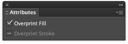
It is also possible to apply overprinting using the Illustrator Attributes panel (InDesign Window menu > Attributes) After selecting the Illustrator artwork with the Direct Selection Tool tick the checkbox to apply Overprint Fill and/or Stroke:
Spot colours used in others apps such as Photoshop and Illustrator are OK to use. Any imported graphics should also use the same naming.
Note: GreenLight is not currently checking vector artwork from Illustrator